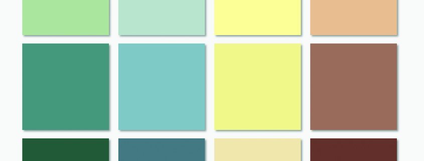
What’s on the colour horizon in 2024?
What can we expect 2024 to bring in terms of colour trends? In short, it will be an equal split between playful palettes and comforting hues.
Forecasting colour trends begins with research. We need to look to multiple sources to see both what’s happening around the world and locally, and from there we can piece together accurate predictions for what’s about to rise in popularity.
Our first resource to look to is the fashion world. Traditionally, commercial interior design takes its cues from residential trends, and residential gets its inspiration from fashion.
Looking this year’s collections from international fashion designers such as Carolina Herrera, Coach, Phillip Lim, JW Anderson and Proenza Schouler, there were distinct colour themes running throughout all their runway shows: purple, green, blue and red.
Of course, nothing is ever this straight-forward. Within this basic range of colours lies a swag of subtle hues and shades that are coming to the fore.
Purple – This year it’s all about lilacs and lavenders, not too pink and not too blue. This versatile hue works in cooler palettes like against concrete floors and soft grey walls. It also contrasts well with natural materials, like bronze, gold and timber.
Green – Maybe it’s the perpetual chatter about the environment, maybe its because we were all cooped up for so long during lockdown, but green is back. It’s a bold choice, but because it’s a forgiving colour, it can lend itself to multiple industries, from restaurants and bars, through to homeware stores even beauty salon fitouts.
Blue –There are two shades of blue to get into this year, navy and powder blue. Both are a calming and serene interior option. Navy adds dramatic effect, whilst not being too shouty. Powder blue harks back to the 1960s, to the nostalgia of a time when everything didn’t feel as serious as it does now.
Red – It starts with cherry red and escalates into soft dusty pinks. Cherry red is not for the faint-hearted. When used correctly, it’s a pseudo-neutral, when used incorrectly, it’s oppressive. The soft dusty pinks are a little tricky too to incorpaote in interiors. The soft pinks look friendly enough, but if they’re not supported by matching pastels, they quickly err on the side of tacky.
Our second source of insight for colour forecasting is to look at the world we’re living in.
With 24-hour news cycles, social media feeds, and the threat of ever-increasing interest rates, our lifestyles have become a bit more stressful. This affects trends because colour has a big impact on mood and mindset.
If we cast our minds back to the 1970s in Australia, it was a relatively free and easy time – we only had one phone in the house, we worked 9-5 with the weekends off, and even seatbelts were optional. Maybe because we all had more slack in the rope, the colour trends at the time were loud and unapologetic. There was a kaleidoscope of burnt orange kitchens, bright yellow laundries and lime green bathrooms strewn across Australia.
Now, with our more complicated lifestyles, we prefer softer palettes to seek refuge in for a sense of calm. Neutrals in every shade of beige will retain their popularity for the foreseeable future, along with cream, apricot and peach shades.
Lastly, we look to the past to see what trends we’ve most recently come from. As we watch the back of Scandinavian Minimalism and The Hamptons ‘50 Shades of Grey’ interiors, their love of natural materials and surroundings has made a lasting impact.
Taking inspiration from the organic hues of timber, terracotta and stonework, we’re seeing spectrums of sandy tones. Blues inspired by the sea and greens derived from the forest round out this palette.
This colour trend immediately invokes calm so it’s possibly best used in office fitouts where providing an environment to easily concentrate in is a key objective.
These three distinctly different colour palettes can all stand alone, but their real strength lies when they’re used together to support each other – sounds a bit like what we might all need more of in 2024.


Leave a Reply
Want to join the discussion?Feel free to contribute!