Serendipity is a hair salon based in the newly developed Newport Marketplace precinct IN QUEENSLAND. The client’s vision was to create a space that was clean, soft, modern and reflective of its coastal surroundings.

Spatial planning for the salon was determined by the two main entry points into the tenancy. The first entry point is located opposite the
esplanade and is highly visible from the external passageway. The second entry point is located towards the car park. Each tenancy in this zone was permitted an external blade sign and an opportunity to display non-illuminated signage on the shopfront glazing for both entry points. Illuminated signage was displayed behind the reception counter to provide additional signage which would be utilized with the high visibility through the shopfront glazing.

The reception counter is located opposite the entry and is near the waiting area. The counter is curved in form and cladded in a Tasmanian Oak dowl timber. On the back of the reception counter is the colour bar and back of house. This room was a challenge and required a thoughtful and creative approach to ensure that the room presented well aesthetically from the front of house, and performed functionally within. This room houses the kitchenette, services and storage. The room is curved in form and cladded in Tasmanian Oak down timber. The colour bar is built into the room and finished in a beige solid surface, neutral laminated and feature brass accents. The hair service zone runs along the edge of the salon and the hair washing zone and dressing areas are positioned on the opposite side, divided by a low height screen cladded also in Tasmanian Oak dowl timber.

The flooring is finished in a concrete look tile which was selected to ensure longevity and durability against dyes and salon products. A Tasmanian Oak laminate is applied to all feature bench work, shelving and joinery to match the dowl timber used throughout. Brass aluminium metal is used on the skirting for all feature joinery including BOH and colour bar. Brass curved handles and rounded mirrors were selected for continuity throughout the space. Tanned leather and emerald green velvet upholstered furniture pieces were selected to soften the interior and tie in with the modern coastal theme. Live planting and feature artworks are used to add the finishing style touches required to complete the design.

Ta-Kumi Madrid, the new culinary reference in the vibrant Spanish capital, further enriches the city’s gastronomic scene. Following the successful concept of its establishments in Malaga and Marbella, Ta- Kumi takes on the challenge of conquering Japanese cuisine lovers in this bustling setting.

The interior design studio, Paco Lago Interioriza, has captured the sober and minimalist essence of Ta-Kumi Marbella to transmit it to the heart of the capital.
The restaurant in Madrid unfolds in a three-story space, flooded with light and transformed into an intimate atmosphere that combines elements such as dark woods, cement and fabrics, enhanced by warm lighting. This fusion between the authenticity of Japanese tradition and a modern aesthetic creates a unique experience.

Inspiration from Japanese fabric prints is applied conceptually, giving the space a sense of movement and dynamism. Traditional elements take on new applications and the furnishings evolve into bolder designs, building a prelude to a playful and unique dining experience.

In a short time of its opening Ta-Kumi Madrid has already been included in the recommendations of the prestigious Michelin Guide, demonstrating its culinary excellence. In this restaurant, diners will embark on a gastronomic journey where product and technique are the fundamental pillars.

Ta-Kumi Madrid has become a gastronomic must for lovers of Japanese cuisine in the Spanish capital. Here, culinary excellence meets a carefully designed environment to create a complete experience for all the senses.

BVN’s redesign of this heritage site in Brisbane features a varied range of functional spaces and long-term flexibility.

The University of Queensland (UQ) purchased state heritage-listed 308 Queen Street and 88 Creek Street in 2019, and its functional intentions were clear from the start: to establish its first official city location. This came, of course, with the most functional of demands for teaching and creative spaces, but it also represented a place to bring together students, staff, alumni and the wider community.

BVN’s approach centres on adaptive reuse in a building that has in fact three distinct layers of history. A 2008 annexe addition, designed by Donovan Hill, provides 450-metre open floor plates, while 308 Queen Street is a fine example of late nineteenth-century architecture that originally housed the National Australia Bank.

The oldest part of the site is now defined by a series of differentiated spaces designed to enhance the uniqueness of each setting. BVN principal, Brian Donovan, explains: “Essentially, we were able to leverage the heritage qualities of the building as well as the opportunities of the contemporary annexe to inform a characteristic architectural and interior design response. The brief sought a space that would engage and bring people together, and create communal areas to support teaching, learning, and postgraduate workshops and engagement. A fundament of that idea is to have variable spaces and choices for how they are to be occupied — the building facilitates that superbly.”

Three types of spaces are used as the organisational devices to meet the brief’s functional requirements: Teaching Suites, Creative Suites and Engagement Spaces.
The latter includes the primary gathering space located in the original banking chamber and, as Donovan notes, features “highly flexible furnishing arrangements conceived to facilitate a wide range of uses – concierge arrival, individual study, group meetings and intimate gatherings along with major speaking and engagement events.”
Above this arrival space are a set of heritage-listed rooms that have been newly adapted into contemporary Creative Suites, while the third type of space is the open floor plate with an emphasis on flexibility.

Just as adaptive reuse aims at a balance between the old and new, BVN’s project at UQ has designed spaces to be unique and differentiated at the same time as encouraging wider user engagement. Its city centre location allows for a certain cross-pollination as a variety of users come and go.

“The original intent of the project was to create a space that would be accessible and engaging for its community,” says Donovan. “When I walk through the site I see many different types of people, from younger students to elderly people, partners and alumni. We can see that the areas of the building that are open to the extended university community are genuinely being used as another communal space in the city, and by a diverse range of people — in my mind, that constitutes success.”

Illustrating the rich experiences on offer at the new UQ Brisbane City, Donovan concludes: “Our approach aimed to demonstrate how the vision [to design a space fostering engagement between students, staff, partners and alumni] could be brought to fruition through leveraging the opportunities that were already occurring inside the building – such as the utilisation of the more flexible, universal spaces within the annexe alongside the beauty and specificity of the heritage-listed rooms.”

CreativeCubes.Co is a hospitality company and platform that converts buildings into thriving coworking spaces and communities. The sites are located in Richmond, Hawthorn, South Melbourne and Collingwood. One of the more recent sites opened is in the heart of Carlton.

The building is among excellent company, in a prime location surrounded by some of Melbourne’s most interesting cultural venues, cafés and restaurants. The space can be found situated within the Lygon Court precinct, tucked behind the iconic Italian café and pasticceria, Brunetti’s, with Cinema Nova and the Italian museum and historical society in close proximity. The rear of the tenancy leads directly onto Drummond Street, allowing pedestrian access.

Lygon Court was an ex-pram factory, demolished in 1980 and later used as an alternative theatre. It has now been totally reimagined into a sophisticated, modern and lively co-working and events space, attracting a broad array of Melbourne’s top-notch entrepreneurs and business executives.

THE BRIEF

This vibrant and energetic 2,000 sqm coworking space was designed by the team at Corso Interior Architecture and spans over two levels. CreativeCubes.Co – Carlton is a diverse space that feels like an extension of the local area. With a spacious and relaxed cocktail lounge
atmosphere, the team at Corso has transformed this former inner-city, dated office building into a warm and welcoming oasis, complimenting the surrounding hustle and bustle of the lively suburb of Carlton.

Inside, the space is a collaboration of dark finishes, plush leather couches, polished concrete floors and an abundance of natural light. Greenery is generously used to create a sense of calm. The Happiness desk is the in-house concierge service that provides helpful and friendly assistance to CreativeCube.Co users. The bricks used on the Happiness desk located near the entrance on the ground floor mimic that of the facade of the building, bringing the outside in. The skeleton of the building had exposed brick walls which were retained in many parts in order to showcase the original look and maintain elements of the history and style of the original building.

Large murals featuring global themes, foods and flowers helps to create an international vibe. Art features emphasise the thriving diversity of the workspace and match that of the surrounding precinct. From colourful murals such as a Japanese cherry blossom tree to a world map featuring a variety of flowers, each piece brings interest and introduces vibrant colours into the interior space.

Colourful pops of neon are found throughout the interior and clever restroom signage helps to elevate the sense of playfulness in the space. This continues to be a theme throughout the ground floor meeting rooms from an African themed Hakuna Matata space with cheeky tiger print wallpaper, to the Super Mario meeting room with fun and quirky noughts and crosses gameboard wall, complete with gaming inspired flooring.

The floor levels are linked by a bespoke staircase. The modern black patina-ed structure winds up through the ground floor to the first floor and draws the eye as a focal point in the room. The main boardroom situated on the ground level features a herringbone white-wash wall,
complemented by industrial glass walls and pendants.

High quality goat hair carpets with simple, elegant patterns are used throughout the meeting rooms.

Positioned directly above the staircase to the east of the building is a large glazed opening that washes the interior below in natural light and filters deeply into the open plan area of the first floor. The client brief was to maximise natural light so the gable skylight roof was the perfect solution allowing for the offices to be designed around this central focal point

THE CHALLENGES

There were three key design challenges; spatial design to maximise the buildings use, allowing for an abundance of natural light, and acoustic considerations for users.

Firstly, from a project viability perspective, the client wanted to ensure that the office space was fully utilised whilst still creating a sense of openness and spaciousness. The team at Corso was able to maximise the space to ensure that every private office and open area has an abundance of light and spaciousness, and each area feels generous and roomy.

Secondly, it was equally important that the layout allowed for an abundance of natural light to filter in and throughout the venue, providing light and bright meeting rooms, offices and minimising the reliance on artificial lighting therefore reducing energy costs. This was achieved through the use of the central large gabled roof on level one. This large glazed opening allowed for generous amounts of natural light to fill the space and was supplemented by strategically placed catenary lighting.

Thirdly, all of the offices were designed with a wall type that minimises sound. Open and communal spaces were filled with a mixture of high-backed seating and booths as well as cleverly placed furniture arranged to create a sense of a semi private spaces.

UNIQUE SOLUTIONS FOR A CONNECTED SPACE

Soundproof phone booths that are acoustically lined are an innovative feature that minimises noise. Noise is often a complex aspect of collaborative work spaces, creating design challenges. To combat this, scattered throughout level one of the building are soundproof booths with vacuum sealed doors creating private little cocoons for important and sensitive business matters to be discussed. Choice of materiality such as acoustic lining in meeting rooms and carpeted floors also help to minimise noise pollution.

Melbournians are craving human connection, a sense of community and the revival of connectiveness. The space at CreativeCubes.Co – Carlton delivers all of these in spades. This co-working space fosters connection, collaboration and networking.

When you step into an office, healthspace or retail space, how do you know where you are, how to find what you need, or even to know what you’re meant to feel or do next? The answer is simple. Signage and wayfinding. Signage and wayfinding are sometimes used interchangeably in the world of design and serve the sole purpose of providing visual communication for users to navigate and experience various spaces and environments.

But there is a slight difference. Signage refers to the visual communications that guide users to achieve a particular outcome like locating bathrooms, reading a safety floorplan, branding a business or navigating to exits. Wayfinding is the holistic process of navigating through physical spaces, and it involves both the physical elements like graphics, signs, digital media as well as the cognitive processes individuals use to orient themselves in a particular environment. Whilst there is an overlap, great design understands the nuance.

“Imagine a chess boardgame. The chess pieces are visual markers representing hierarchy of characters while the black and white squares on the board is the navigating system that allows users to play a game of chess. So if signage was the chess pieces, then wayfinding is the board,” explains Ghezal A Jafari, Design & Strategy Lead at Concept, an Australian-owned fitout company designing and delivering people-powered work, health and retail spaces.

The evolution of solutions

Historically, wayfinding refers to the techniques used by travellers over land and sea to find relatively unmarked and often mislabelled routes. Typically in architecture, signage and wayfinding was implemented in the later stages of design, which often resulted in rigid, monotonous and bulky structural solutions that lacked aesthetics and made most signage elements feel like an ‘after thought’. The impact was costly to both design firms and clients with additional expenses for the design and implementation of signage, changes in floor plans, and added timeframes for project delivery.

Fast forward to 2023 and signage and wayfinding design has emerged as a key consideration of successful built environments. It enhances and elevates both brand and user experience while creating a sense of curiosity to navigate through and interact with various spaces.

Finding a place in great design

Effective wayfinding paired with intuitive signage in the workplace, healthspace or retail space ought to be a key consideration of great design and build.

“It can be the creative and competitive edge a business needs to attract the best talent and clients, as well as deliver an optimal user experience” states Ghezal.

“Smart design in signage and wayfinding can also have multiple health, psychological and emotional benefits to users,” she also shares.

“It contributes to a positive work environment, reduces stress, enhances productivity, elevates emotional experience, and fosters a sense of belonging in the workplace community. By creating a sense of familiarity and connection with different spaces users can easily adapt and have a seamless experience.”

Design Considerations

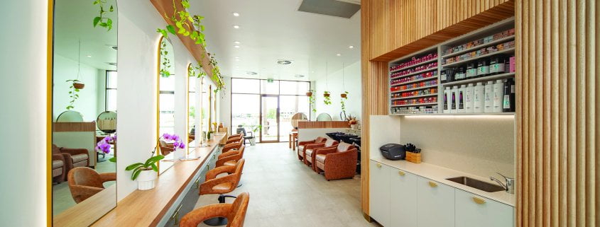
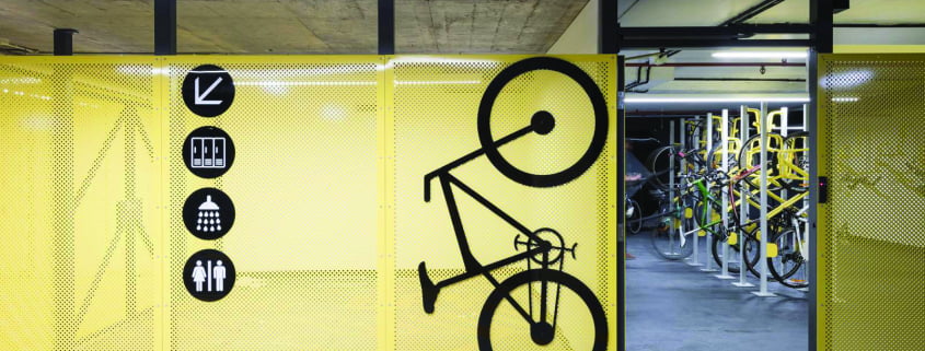
The design aesthetics for intuitive signage and wayfinding, especially in the post-covid era, has changed the way users perceive and utilise certain spaces. For example, signage in shared public places such as end-of-trip facilities, hallways and lobbies have transformed functional spaces to be more interactive, digitally dynamic, and creative, which reflects on the brand personality of both the business and the building.

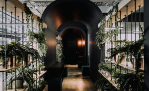
Creative graphics on surfaces including floors and digital walls elevate the functional with style, informing users as to how to interact with a space. The emerging trend of flexible spaces and creative zoning, often via the use of neon signage or graffiti in an agile and open plan area, inject personality and allow users to transform the space to suit multiple purposes at different points in time.

In other examples in an open plan workplace, lockers are increasingly used to divide and define zones without creating barriers. They are used as soft barriers, which when thoughtfully designed, differentiate different spaces without adding enclosed walls and surfaces. In addition, a touch of playful graphics, planting, and zoning created by the mirroring of pathways through conscious flooring material changes and ceiling lighting effects create enhanced visual cues to allow users to navigate through spaces seamlessly.

Incorporating accessibility points into wayfinding design ensures that everyone, including individuals with disabilities, can have comfort, ease of access and a positive user experience. These include braille tactile signage, clear visual and auditory cues on all surfaces (where practical) and technology points for mobility-impaired users. A compliant workplace environment ensures these elements are incorporated well in all spaces to create an inclusive environment for all users.

A well-executed wayfinding system empowers users to confidently navigate a space. However, too much information can also be overwhelming and can make it difficult for users to process what’s relevant for their needs. For example, multiple signs and complex layouts can create a cognitive overload for users to decipher the information given and navigate around. Simplifying the presentation of information and using clear symbols can help alleviate cognitive overload.

Finding the right balance between providing essential information and information overload is crucial for user confidence and interaction within a space. This confidence contributes to an improved sense of control and mastery over their environment, leading to a positive emotional experience.

Now and into the future

People tend to associate their surroundings with certain feelings and emotions whilst exploring and navigating through spaces. Investing in signage and wayfinding allows businesses to create an environment where users can connect and associate positive emotions, ultimately enabling them to attract top talent, clients and have their brand stand out in a competitive market.

“If there’s anything we learnt from covid, it was the immeasurable value of ‘experience’ we constantly seek in life, whether it’s new places or renewing current ones to gain a fresh perspective”, says Ghezal. “Designers have been facing the challenge of creating fresh new experiences in the post-covid workplace to entice users to return back to the office. The shifted focus on signage and wayfinding to more playful graphics, digital interactive surfaces and flexible space transformations encourage people to come together, celebrate, collaborate and share experiences.”    

By focusing on clear communication, logical layouts, sophisticated design aesthetics and considering users’ emotional responses, designers can create effective signage and wayfinding solutions which elevate brand and spatial perception and enhance user experience.